Monday, October 17, 2011

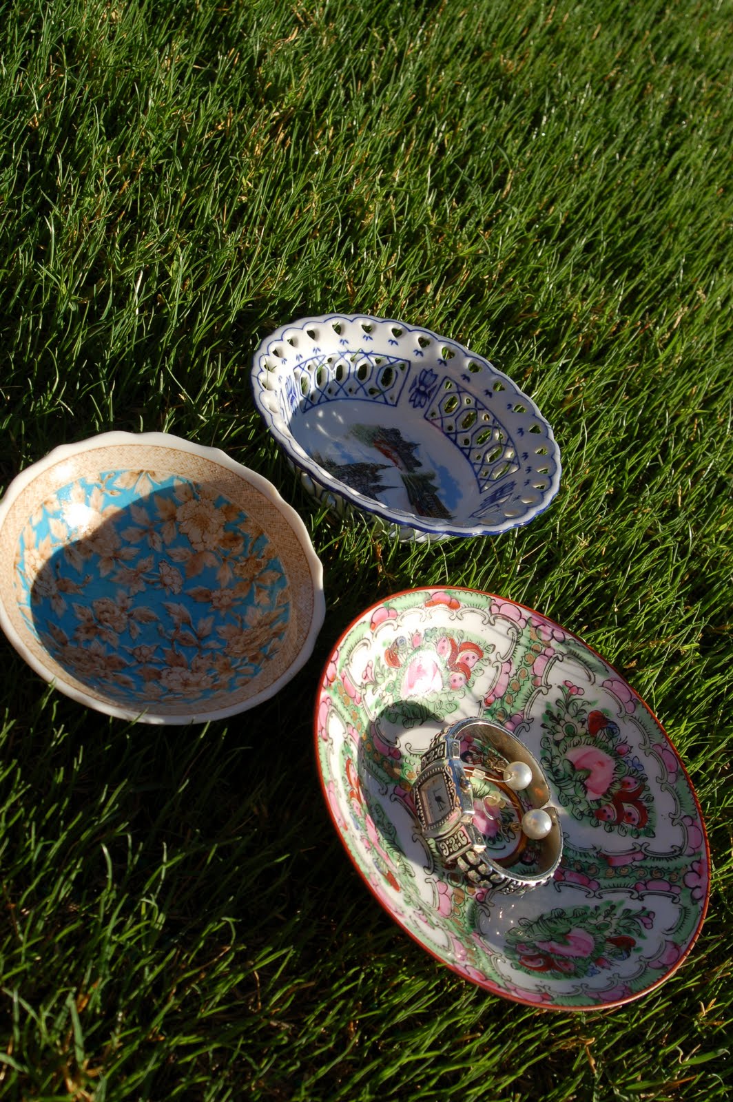
I love to give these as gifts

I enjoy having a small bowl or "dish" to place my rings and other jewelry in. I use one on top of my dresser for my wedding rings and frequently-worn earrings, one next to my kitchen sink for my rings when I'm washing dishes and I like to have one for guests when they spend the night.


They're also lovely for paperclips on your desk or to hold lemon slices at a tea party. You could even use one at each place setting at a dinner party to hold a pat of butter or a condiment.


When I started looking for them, I found them at Goodwill and other thrift stores for anywhere from 75 cents to no more than $3 each.


These make lovely, thoughtful and inexpensive gifts. They're easy to collect and keep on hand for a gift-giving occasion and they're small enough to tuck into a gift bag. See? The one I just found was only $1.49 at Goodwill.


Just check the bottom to make sure it isn't cheap ceramic or "made in China." It's fun to hunt for one in a friend's favorite color or that matches her decor.


The hard part will be not keeping them for yourself {and keeping your mom from stealing them from you--that's what mine did!}!

Saturday, October 8, 2011

Everyone loves punch

Here I am with my two dear friends, Chrissy and Rebekah, at Rebekah's baby shower today. We're so excited--she's having a GIRL!


My mom and I found her this funky outfit--no pastels here!! I made the flower (with a little touch of WILD) to go with it.


And where I come from, a shower just isn't a shower without punch.


I made this one with a can of raspberry lemonade concentrate watered down with a 2-liter of 7 Up and a bottle of raspberry sparkling water, with two containers of rainbow sherbet spooned over the top. That's ice from Sonic, by the way. Did you know they sell bags of ice for $2???

The soda and sherbet can be changed to achieve a different taste or color. For St. Patrick's Day, I do a can of limeade concentrate, 7 Up, a lime sparkling water and lime sherbet. It's hard to do punch wrong so just go for it!

Everyone loves punch. Make it for your next get-together and watch it disappear!

Wednesday, September 14, 2011

A tour of my new studio/craft room

Welcome to my studio/craft room!

Let's enter the room to the left and move around clockwise, okee dokee?


Bookcase with my most-used books, including my NEW color theory and interior decorating books. The bookcase is the Billy from IKEA.


Teacup and apron collections.


Seating area. Scored the wicker chair at a garage sale for $7. The garden stool is my favorite color, I got it at Ross for about $30 (I was thrilled).


Artwork wall above the seating area, BEFORE I added more fun pieces! :)


And AFTER! "More is more" in this case! I scored the rose artwork for $5 on clearance at Target and the metal bike for $10 at Hobby Lobby to round out this wall. Yeeesss, the shadow box is still empty.


Another angle. With the 10-foot ceilings, we hung everything high. I think I like it! The little white shelf closely resembles my white chairs, I got it at Goodwill for less than $3.


Dresser and hutch. I took it out of the boys' bedroom. They don't need display space (or an excuse to climb up on the furniture).


Close-up of the tea station. I want to get a French press for my coffee-loving friends, too.


Hutch, screen and work table.


Day bed, temporary side table and new quilt. I was so happy to find a quilt that's pink and turquoise with a hint of green....WITH owls! I found it in the kids' department at Homegoods.


I love my IKEA day bed! It retailed for $99, is no longer available and I scored it on Craigslist for $75. I'd been eyeing it for several years and my husband got it for me as an anniversary gift in August.


Workspace and craft supplies. This table was a freebie from a friend that I painted green, then re-painted white. It's nice and big to spread out my projects, and to craft with a friend. I'm getting a lot more use out of my Southern Living at HOME silverware caddy now that I'm using it to hold art supplies and crafting tools. My boys enjoy sitting with me and coloring and drawing while I work, too, so I always keep their stuff accessible.


Crafting area with fabric and card-making supplies and Ott lamp. My photo storage boxes are indispensable for storing my craft projects (I've since added more). The framed cork board is from Homegoods. I'm going to use it to show clients potential color schemes.


I love the wicker "shelf" I found to display my favorite rubber stamps! It's easier this way for my friends to find the stamps they need for their projects, too (without digging through the ten pencil boxes I keep the rest of them in).


If you came in and closed the double doors, you'd see my bulletin board. This one will be purely functional so I wanted it to be hidden. As much as I'd love every square inch to look like a magazine, it DOES have to WORK!

And this room definitely WORKS!

I adore my new room! The wall color is "Tame Teal" by Sherwin Williams for anyone interested. Any other questions, just leave a comment!

Thursday, August 25, 2011

Studio Sneak Peek

My space in our new house is going to be soooo much more than "just" a craft room so I'm trying to get use to calling it..."My Studio." Wait 'til you see this room! When we toured this house, my heart skipped a beat when I saw this space.

My wonderful hubby trimmed out the ceiling paint last night (while I was out galavanting with my mom at the mall!) and I'm waiting on him to do the baseboard before I load up my big pieces of furniture.

In the meantime, however, I am making some progress! Here's a sneak peek!


{studio seating area}


{fabric}


{tea tray}

I hope to reveal the whole thing (as a work in progress, of course) VERY soon!

Saturday, July 30, 2011

choosing paint

http://www.housetweaking.com/2011/02/01/you-hue-sherwin-williams-sea-salt/

As for the colors, I debated and debated for weeks. Aqua walls and neutral decor? Gray walls and colorful decor?

Gray? Aqua? Gray...aqua??

"Sea Salt" gave us both.


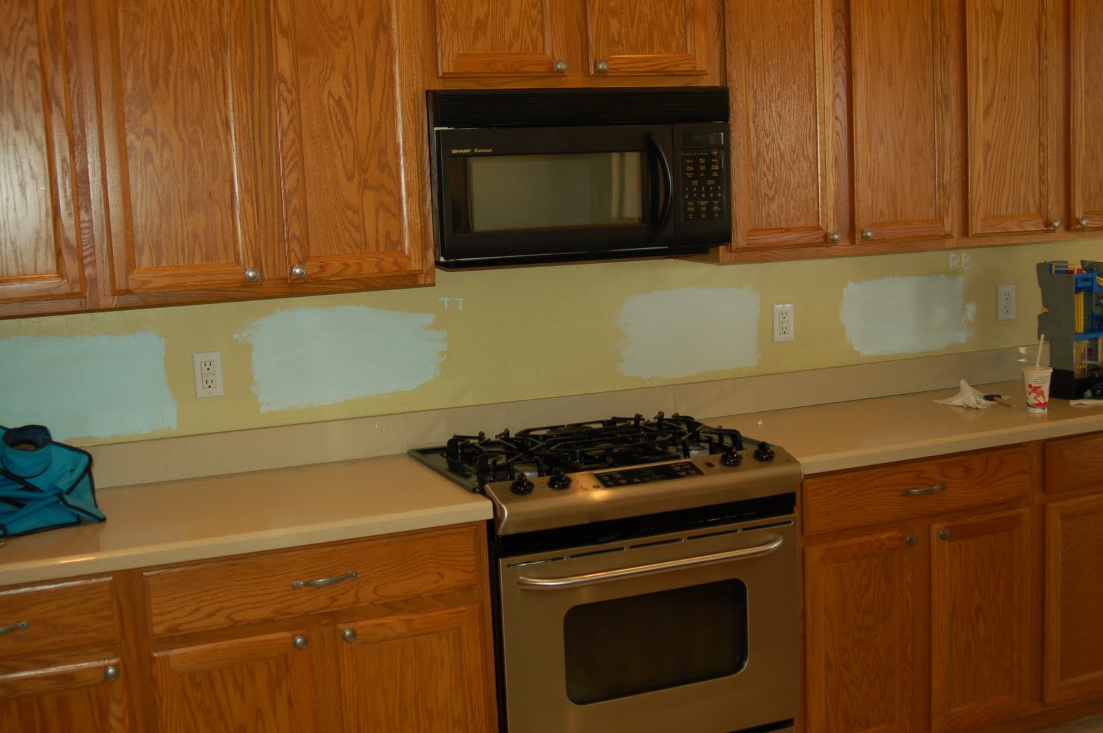
When I settled on "Sea Salt," I knew it had blue/green undertones but looking at the paint chip, and the samples I painted on the walls, we really thought it would be gray.


(the one to the right of the stove)


Boy, were we surprised when it started going up on the walls. My husband and I looked at each other all day, saying, "It's blue."

The family room wall, just to give you an idea of the color. Love it.


Paint Matters

We moved.

Our new place is AMAZING. I feel like I'm living in someone else's beach house for the weekend (and enjoying every minute of it) but Monday, I'm gonna have to go back home. It's a little surreal.

In a new place, you get a lesson on accentuating the positive. This place has 10 ft. ceilings, a reeeaaalllly wide front hallway, fabulous 18" tile floors, lovely kitchen counters (granite and Caesar stone!) and big, light-filled rooms. I told you--lots of positives! And the previous owners painted it...Dog Puke Yellow. It was a dirty, mustard-y, lifeless, brownish yellow. No redeeming qualities and didn't do this beautiful house any favors.

So! My first order of business: PAINT.

Thankfully, my dad is a long-time professional painter and my husband has a lot of practice painting interiors. I did not hesitate to put them to work. I just could not abide the yellow. And our time-frame allowed us to paint for two days before the actual moving process started. Painting an empty house is the way to go.

And now for some before and afters!

I will be tweaking this house for...well, probably for as long as we live here! So this is just the 1st of MANY "afters!"

{paint color details appear at the end of this post}

The dining area, BEFORE. I knew I wanted to give this space a little "wow" because it gets nice light and frames the backyard view. Our rental had no back yard so you know I'm appreciating this one!


AFTER. My only accent wall, painted in "Aqueduct," with our dining room table and chairs. I envision bamboo shades for these windows. Someday I may paint the table and chairs black.


A different look. These were the cookies waiting for Andrew when he arrived home from school after his first day of kindergarten!


My baby started school! Sniff, sniff. As cute as he is, all I'm looking at are the wall colors behind him!


Kitchen BEFORE. To me, the paint color just makes the cabinets and counters disappear.


(almost) AFTER kitchen. Our new color makes the taaaallll cabinets stand out and compliments the Caesar stone counters. It wasn't trimmed out yet, nor was the ceiling done. I'll add that "after" ASAP!


Pantry was just dingy! BEFORE...


...and AFTER. Just gave it a cleaning and two coats of "Swiss Coffee" white. The paint was trimmed out around the outside at this point, too, which really helps.


Looking from front door, BEFORE. This was from the MLS listing.


...AFTER. I envisioned our turquoise sideboard here, I think it will stay. Just needs some artwork above and accessorizing.


The hall looking toward the front door, BEFORE.


The hall, AFTER.


I adore the bright, light, airy feel! Plus it's still very neutral, so we can add more fun colors to the mix. I'm very excited about personalizing our space! Stay tuned!

INTERESTED IN THE PAINT COLORS? "Sea Salt" walls (eggshell), "Crystal Clear" ceiling (flat) and "Swiss Coffee" trim (satin). All Sherwin Williams.

The three paint colors together.


And in natural light.


More to come!!